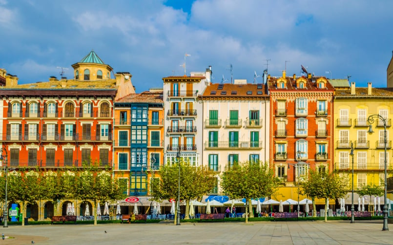
A good pedestrian plaza breathes new life into an area, and can serve as a gathering place for both civic and social matters. A central plaza or square serves a critical role in an urban area’s overall vibe, it can draw people in and increase traffic to local businesses.
There are pedestrian plazas all around the world. Some offer excellent examples of design, while others offer lessons on what not to do. A ‘failed’ public plaza is one that is empty and unused, virtually a waste of space.
In America, public squares have more recently gained focused attention for the benefits they can provide. While in Europe, pedestrian plazas have a much richer history as gathering areas for civic, social, and commercial interests.
William Whyte’s Research on Public Spaces & Successful Pedestrian Plazas
In 2004, the Project for Public Spaces released a list of the worst and best plazas and squares from all over the world. Their findings were influenced by the well-known urban sociologist William Whyte, who conducted extensive research on what makes a coveted and useable pedestrian plaza.
Whyte employed time-lapse photography to track street life and pedestrian activity in several major cities. He found the most important factor for attracting people was to create a mix-used space. His research showed the power of food vendors to attract crowds. If food vendors were kicked out of a space, his photographs showed the space going largely unused again.
Whyte found art to be another important factor that attracted people to a space and encouraged them to hang around. He documented people inspecting, walking up to, and lingering around a large outdoor sculpture in the Chase Manhattan Plaza in NYC.
Lessons Learned from 5 Pedestrian Plazas
An overarching theme in Whyte’s research is the importance of multi-use spaces. His findings are further highlighted through the following examples of successful and failed pedestrian plazas around the world.
1. Empire State Plaza in Albany, New York
Lesson Learned: Wide open empty spaces are uninviting and intimidating
Empire State Plaza in Albany, New York made the Project for Public Spaces list for the worst public squares. This plaza is pretty in pictures but it is far from functional. Its wide open and empty space proved far from inviting. Plus, the high walls and out-of-scale architecture get in the way of pedestrians viewing what is beyond the steps.
2. New York Times Square
Lesson Learned: Make the space adaptable over time so it always remains relevant
According to Forbes.com, approximately 26 million people visit Times Square in New York every year. That means it is easily one of the busiest places in the US, which requires same careful planning. A complete redesign of the space was conducted 7 years ago.
The focus of the redesign was on ‘placemaking,’ or rather, creating a canvas that could be altered or added to over time to remain relevant and fresh. This highlights the importance of a multi-use space, as the area gives people a chance to use the space in a variety of ways, whatever speaks to the community at a given time.
Times Square is a cultural hub and the city wanted to attract people to the area, you know, make it comfortable to hang out for a while. So, they added electrical outlets to re-charge cell phones and comfortable seating in prime locations. Plus, we are proud to report, TerraCast Planters were added for a pop of natural greenery and pretty color.
Times Square could have used any planters they wanted, but they chose ours. Benefits of TerraCast Planters include:
- Can stand up to a much wider range of temperatures than other leading planters without suffering damage from things like freeze/thaw cycles
- Made in the USA using sustainable manufacturing processes and carefully sourced materials
- Fully customizable
- Non-porous and resistant to stains—even graffiti can be scrubbed clean with a Mr. Clean Magic Eraser
- Lightweight for easy transportation and cheaper shipping costs
- Made from recycled materials—black planters can be made with nearly 100% post-consumer recycled materials
Shop our wide selection of planters
3. Diagonal Mar in Barcelona, Spain
Lesson Learned: Avoid uninviting materials and don’t forget to add seating
This city square has a lot to offer but some of its major drawbacks shed light on what not to do. For one, the central plaza is caged by an uninviting barbed wire fence—a big no-no. Secondly, the benefit of the beautiful water running through the space is reduced because the water is not near the busiest part of the park. In addition, there is not enough seating, and this makes people prone to pass through but not stick around.
4. City Plaza in Boston, Massachusetts
Lesson Learned: Limit steps and other obstacles
The take-away lesson from this city plaza is to avoid adding challenging steps or other obstacles. This prevents people from moving as freely throughout a space and can be limiting to anyone with a physical handicap. While Boston’s City Plaza is large enough to host planned events, it doesn’t naturally attract spontaneous gatherings.
5. Pershing Square in Los Angeles, CA
Lesson learned: Make it visible from the street
This quirky and fun square in LA has a lot to offer but many people passing by don’t even know it’s there. When you look in the direction of the square from surrounding sidewalks all you see are blank walls and parking garages. You must physically walk inside of the square to find the visually appealing gathering space. This lack of transparency impacts the level of traffic this pedestrian plaza sees.

