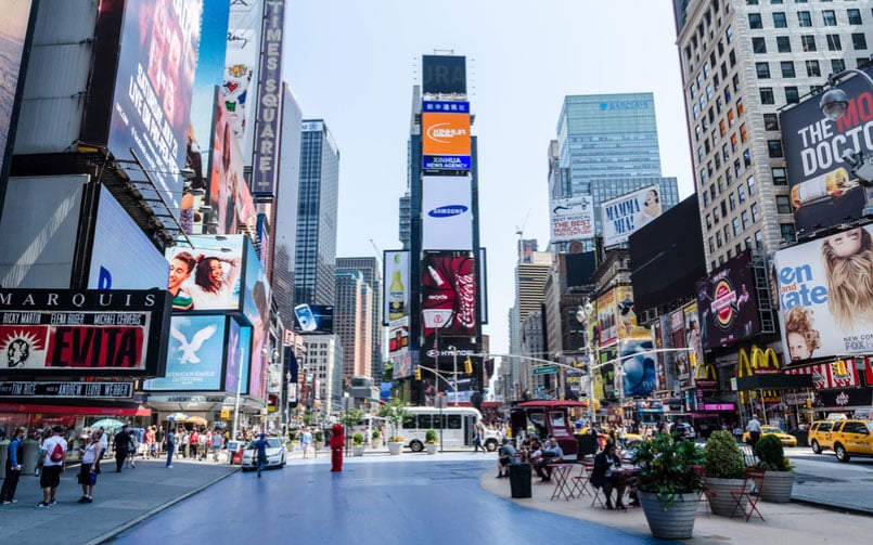
Looking to redesign a mixed-use space, such as a public square, why not take inspiration from New York’s Times Square design? After all, it’s one of the most popularly visited spots on the planet and the most recent set of renovations left the square feeling more spacious and magical than ever before.
If you haven’t visited Times Square in the last 6-years or so, you’ll find the place looks a little different than it used to and it feels different too, it’s a lot more spacious and less congested. 2017 marks the 6th year anniversary of the Times Square redesign, which was focused on doubling usable pedestrian space and creating a vibe that reflects the artsy and varied culture of NYC. Prior to renovations, Times Square was tightly-packed with people making it hard to walk or even breathe.
The Times Square Design is all about Simplicity
Architectural firm Snøhetta won the bid for the project because of their simplistic design that favored people over traffic. The design was intended to help New York city’s famous landmark thrive in the future—and it’s been a total success. Like other highly-trafficked public squares around the world, Times Square now caters to the people who use it, which works better for everyone. Even local stores have seen an increase in sales since the redesign took place.
Snøhetta spent plenty of time people watching in Times Square—a favorite pastime for many—but they took it as seriously as their jobs, well, because it was. They watched how people moved through the space and where they congregated, and from this detailed analysis they formulated a plan that would work better for everyone. “The square is the ultimate diverse, multi-use, dynamic, changing public space,” said Fred Kent, the founder of the Project for Public Spaces.
To make the space feel more open, designers at Snøhetta knew Times Square needed to be more pedestrian-friendly and less automobile-friendly. This is a common design trend taking over large cities in recent years.
What is Placemaking?
Placemaking is a term used to describe a space that focuses more on simplistic designs that can be fine-tuned over the years based on community needs as they evolve and change. You don’t need to do a whole lot to create useful public plazas, in fact doing too much often makes a space less usable and in need of renovations in a shorter amount of time.
Placemaking adds a lot of flexibility to a space, which is important because one public square must serve so many purposes for so many different people. For some, Times Square is a once in a lifetime bucket list adventure, for others it’s part of their daily walk to work, and for others it serves as their personal stage. Plus, simplicity allows room for lots of growth and change—the only things guaranteed to take place in the future.
“The goal is that Times Square and the plazas serve as a kind of cultural hub, reflecting the creative and cultural talent of the city,” said Tim Tompkins, the president of the Times Square Alliance. The Times Square design now reflects the needs of tourists, locals and performers in so many ways.
What Was Added to Times Square?
- TerraCast Planters
Designers added TerraCast Planters to the space for pops of natural color and beauty. They selected our resin-based planters because they are made strong to stand up to freeze-thaw cycles, impact damage, bright sunlight, and even graffiti. Just like the rest of Times Square, the goal was to use planters that could surpass the test of time.
- Plenty of Seating Areas
Five different benches were added throughout the plaza, some are long benches and others have built-in nooks to suit various seating positions. Benches are designed to face one another to create a more homey space where people want to congregate.
- Electrical Outlets
Each bench is equipped with electrical outlets that offer enough power to charge your phone or even put on a Broadway-style show. New York is all about big productions, and so the square needed to double as an “ever-changing theater set.” Furthermore, the whole world relies on cell phones and other gadgets that need to be charged, so charging portals add a lot of modern convenience.
- Expansive Crosswalks
Crosswalks were expanded to measure 40-feet in width, thus giving people more room to navigate the area.
Moving into the future, the Times Square Alliance has plans to add new food vendors and public furniture installations that rival your favorite childhood playground.
Why TerraCast Planters Were Chosen for Times Square
We are proud to say our planters were used to outfit the innovative and highly trafficked Times Square, and for good reasons…
- TerraCast Planters are resistant to freeze/thaw cycles and can withstand a much broader range of temperatures (both hot and cold) than any other planter.
- They are non-porous, which makes it easy to remove graffiti and other stains using something as readily accessible as a Mr. Clean Magic Eraser Wipe.
- Low maintenance—resistant to cracks and other common forms of wear and tear associated with planters.
- They are beautiful and fully customizable
- Lightweight and easy to move + cheaper to transport from the get-go
- Made right here in the USA using sustainable manufacturing processes and carefully sourced materials.
- All planters are can be made from recycled materials, and dark colored planters can be made using nearly 100% post-consumer recycled materials.
- All planters are recyclable once they complete their life cycle.
Check out our wide selection of commercial and residential planters https://www.terracastproducts.com/our-shop/planters/

